

Last week I published a preview of the new R2T methodology (R2T v2: The Return, The Upgrade). Most of it stayed deliberately loose, but one section referenced data issues. It said that removing survivorship bias would drag a family of data gremlins into the open.
Well, that became my own personal odyssey this week. And since The Odyssey is a cultural phenomenon right now, Greek mythology references are in vogue again. I had to jump on that bandwagon.
(And yes, I know the “thousand ships” line was not Homer. It was Christopher Marlowe.)
This piece explains that odyssey, in more detail than I expected to have. Preparing for the R2T launch turned into a guided tour of the landmines you have to find before any official backtest gets run.
Why do this? I want this publication to be honest and rigorous, and rigor doesn’t stop at the strategy math. It applies to the data underneath, or none of the rest means anything.
A manager of mine once called work like this “breaking rocks.” I call it “clearing the data mud.” This work is not sexy. It is not fun. But it is absolutely vital for credibility.

Refresher: Survivorship Bias
A quick refresher, since everything downstream depends on it. Survivorship bias is what happens when you evaluate today’s index members historically. You have quietly excluded every company that died, merged, or fell out along the way, and the exclusion isn’t neutral.
Survivorship bias flatters results in exactly the direction that gets strategies published, because the names that survived are, by construction, the names that did well enough to survive. Fixing it requires point-in-time membership records, a bar-by-bar account of who was actually in the index, delisted names included. That requirement is where all the complexity in this piece comes from.
Removing survivorship bias doesn’t remove problems. It trades easy problems for honest ones. That trade is this piece.
Working with historical data: the price of admission
Mid- and small-cap daily history is a new dataset for Alpha on the Edge, and I knew from experience what was coming. This data is messy, and that’s nobody’s fault. Managing complex market datasets is extremely difficult. I know because I’ve had to manage small corners of them, and the corners alone taught me humility.
So you will not read any vendor or index-provider complaints here. Imperfect data is the normal course of business. What a practitioner gets is a choice, made over and over. Handle each issue with a judgment call, or pass it through untouched and make it the next person’s problem. What follows is a tour of those judgment calls.
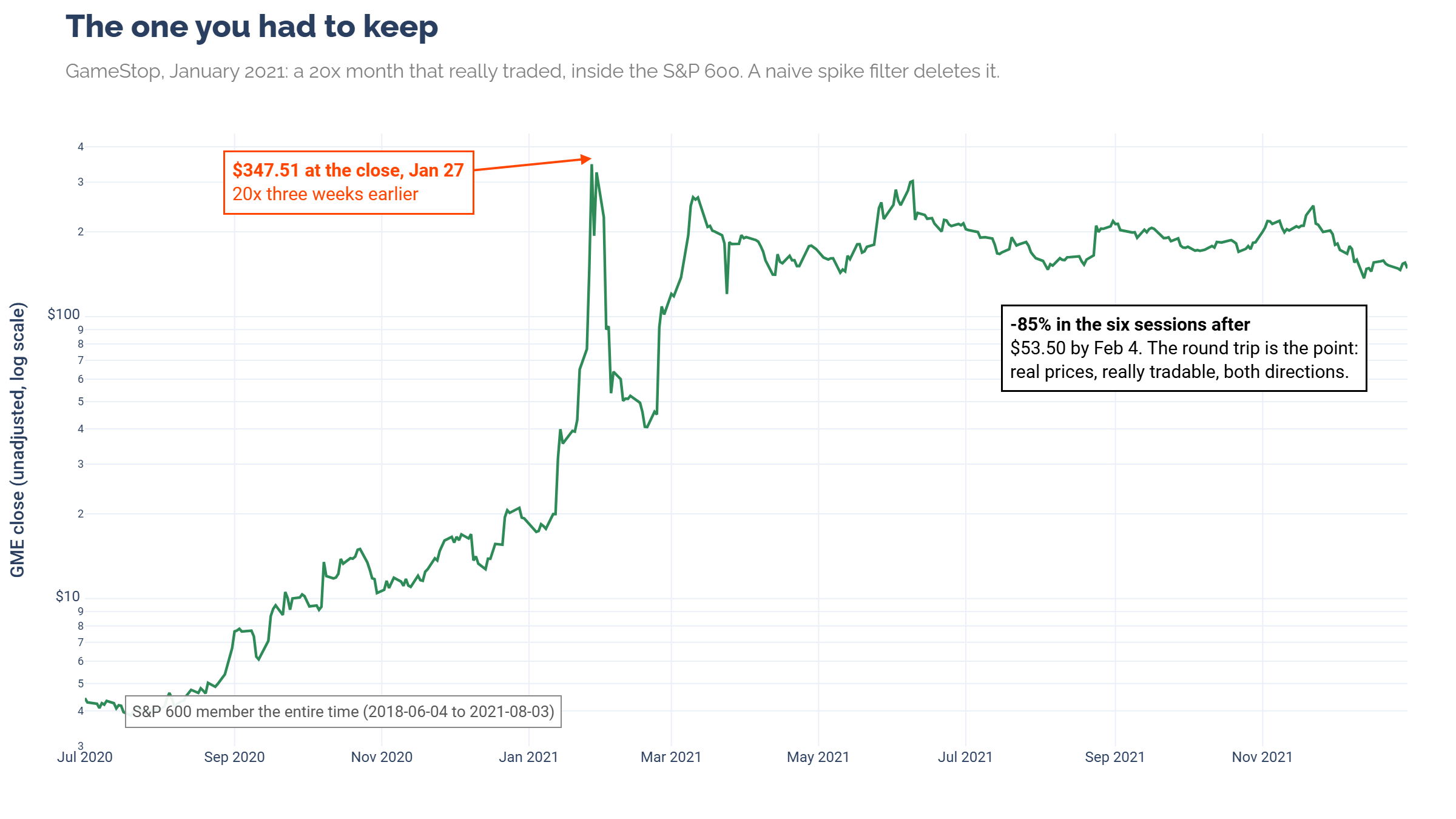
The most obvious landmine is the price spike, a print wildly out of line with its neighbors that makes volatility explode. Spikes are dangerous for backtests because volatility feeds everything downstream. Position sizing, stops, and Sharpe ratios all inherit whatever the vol estimate believes. The trap is that some spikes are real.
As many of you will remember, GameStop in January 2021 was a genuine roller coaster, and you could genuinely have traded it. Twenty-fold in under a month, then most of it given back within a week, all while sitting inside the S&P 600.
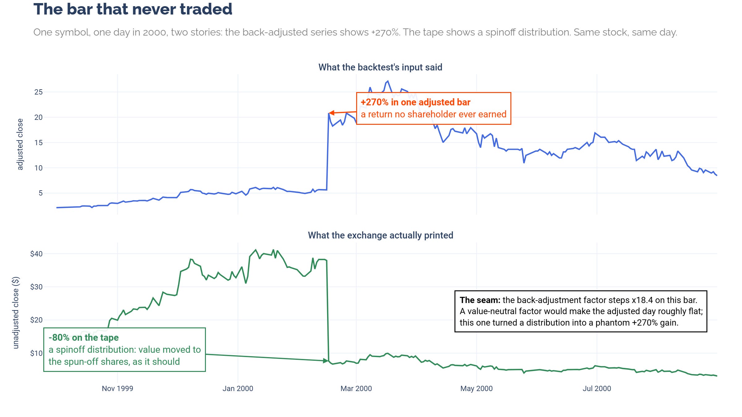
Others are stranger. The chart below shows a single day in early 2000 where the adjusted price series prints a +270% return while the actual tape recorded an 80% loss. The event underneath was real, a spinoff distributed to shareholders and worth real money. But the +270% never traded. Nobody bought at the open and tripled their money by the close. It’s what happens when a corporate action gets folded into the back-adjustment seam at the wrong scale, and a pipeline that consumes adjusted prices without ever checking them against the unadjusted tape will book that day as the trade of the decade.
A screen that deletes everything weird deletes GameStop. A screen that keeps everything weird keeps bars that never traded. You have to know which is which.
Onboarding this dataset meant a lot of scrubbing. Walking bar-level quality flags, deciding which bars were eligible to trade and which weren’t, building screens so the next bad bar gets caught by machinery instead of luck. I’ll spare you the plumbing details. The point is that this work happens before a single backtest is worth believing, and it never shows up in anyone’s results table.
It also happens at scale. The universe behind R2T covers 4,324 instruments across US large-, mid-, and small-cap stocks since the 1990s. A single configuration of a single mid-cap backtest run touches 6,550,068 daily bars, and each run carries ten walk-forward configurations. The full-history small-cap run alone executed 17.1 million simulations. Across every member’s quoted history, the panels hold 20,262,375 daily bars.
We’ve handled the scrubbing. So the data’s ready, right?
Right?
The chart that launched a thousand ships
Universe-aware backtesting adds a second layer of decisions on top of price hygiene. Cleaning the bars gets you time series, but it doesn’t get you the time periods to actually use those time series.
So you have to draw borders, and I designed R2T v2 with a clean border definition. A universe member is an index member, by the point-in-time record.
Then, I made a mistake that is obvious in hindsight and was invisible until one chart made it visible.
The mistake lived in the walk-forward split geometry. I calibrated it the way R2T v1 did. It was blind to point-in-time universe constituency, tiling evaluation windows over each stock’s full quoted price history.
Meanwhile, I added universe membership as a gate to tradable bars. The idea was that bars outside membership windows were not allowed in the OOS splits.
Two rulers, measuring two different date ranges. The splits were measuring a range the strategy was never allowed to trade.
Every gate I built kept every promise it was given. The promise that evaluation windows would be bounded by membership was only carried out at trade simulation time, not at split-determination time.
When I ran the R2T v2 dress rehearsal, that gap surfaced as one flat line.
This is why you run dress rehearsals, and why you look at the results instead of filing them. When I first saw this chart, my first guesses were wrong twice. I suspected bad prices for the flat stock. I suspected warm-up leakage for the flat portfolio start.
The chart didn’t care what I suspected. Visualizations don’t lie. They just wait for you to catch up.
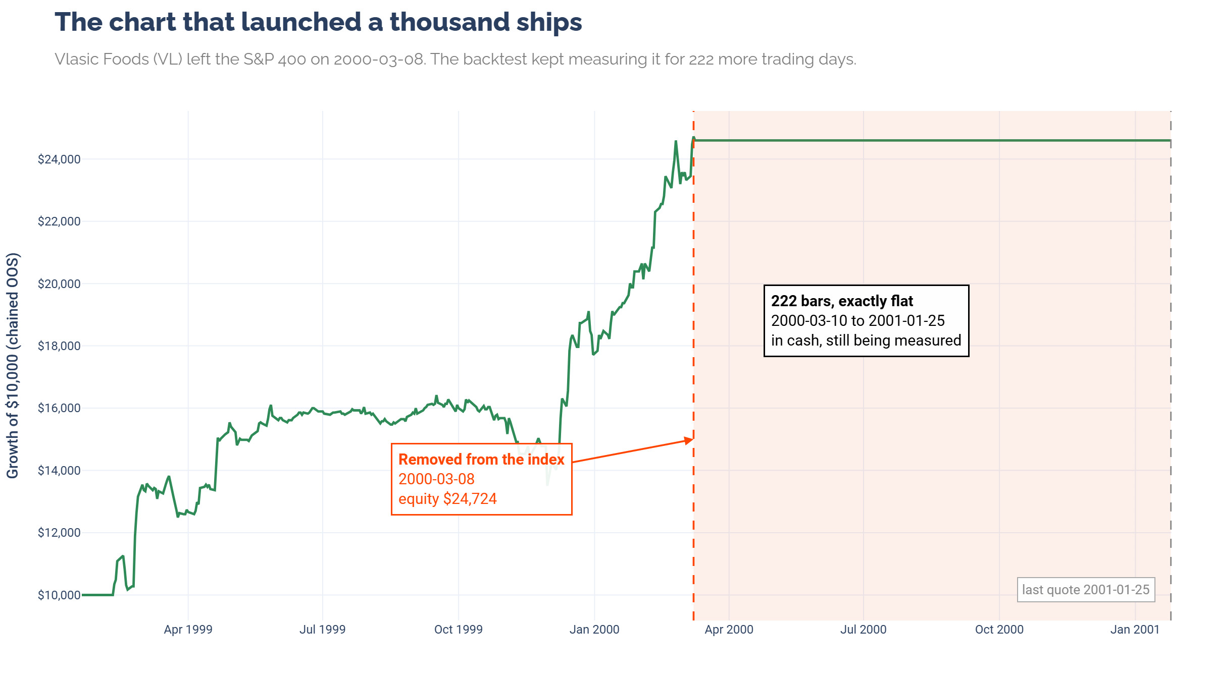
Here is what the hero chart shows. The membership gating worked exactly as designed. Vlasic was force-exited on removal day and never traded again. But the measurement didn't stop. The performance record kept the name on the books in cash for 222 more bars, and those bars flowed into the return stream like real trading days. All of this because the WFO splits were not configured on the same dates.
So I went digging, face in my palm most of the time. The problem was so obvious. Look at another manifestation. Return history in this dataset began before index inception, but the WFO splits didn’t know this. So we get an abomination like this:
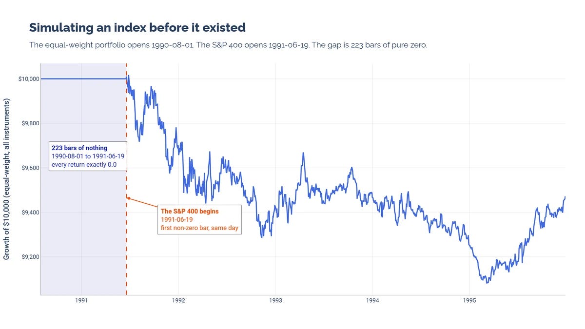
That kind of exactness is a gift, because noise doesn't line up with anything. It tells you the problem is structural.
So what is the flat line actually showing? Every price on the chart is real, so it isn't a data error. No position was ever held past removal day, so it isn't a trading bug. It's a measurement bug. The simulation kept retired stocks on the books in cash, and those cash bars flowed into return streams, volatility denominators, and Sharpe ratios. An ugly stream of zeros, dressed as evidence.
Once you know the padding exists, the next question is how much of the run was padding. The answer deserved its own chart.
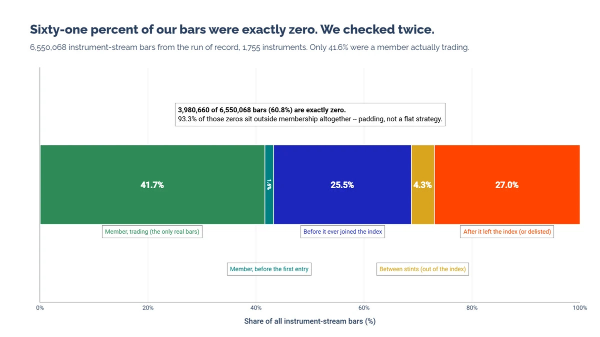
The census puts numbers on the damage. Of the 6,550,068 bars in the US mid-cap run, 60.8% were exactly zero, and 93.3% of those zeros fell outside membership. Only 41.7% of all bars were a member actually trading. One hundred forty-four instruments had zero overlap between their membership and their evaluation window, and still produced full return streams and full rows of metrics.
The distortion isn't hypothetical. Re-measure Vlasic over a membership-clipped window with the identical trades and its annualized return goes from 55.9% to 120.8%, its Sharpe from 1.99 to 2.69, without a single trade moving. Pure denominator distortion, and it runs in both directions across the portfolio. The aggregated equal-weight line was diluted roughly 2.4×.
About the "we checked twice" in that chart title. Before believing any of this, I re-executed a single symbol bit for bit outside the pipeline to prove the chart was the simulation and not a rendering artifact. It was the simulation. That run is now retired, kept as an exhibit of shame, and everything was re-run.
You’d think “in the index” would be simple
If you haven’t worked with membership data, you’d assume it’s easy. One day a stock joins, one day it leaves, two dates, done.
That is unfortunately not the case, which is the polite way of saying this part makes you want to pull your hair out.
None of what follows is a complaint about the data. The data faithfully records a complicated world. The complications are the world’s.
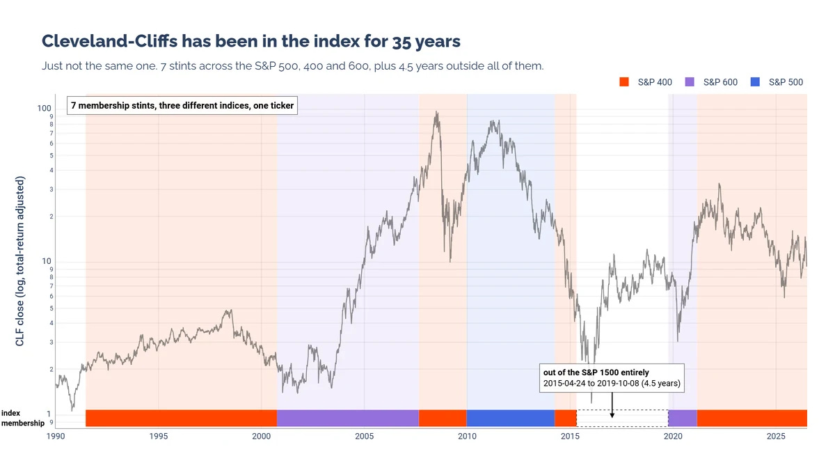
Consider Cleveland-Cliffs, which has been in the S&P 1500 for 35 years, provided you don’t ask which index. Seven separate stints across three different indices, plus four and a half years outside all of them. One ticker, and every one of those transitions is a decision a backtest has to get right.
Then there's flicker. The raw membership panel for one name blinks out for a day or three at a time, over a hundred times across its history.
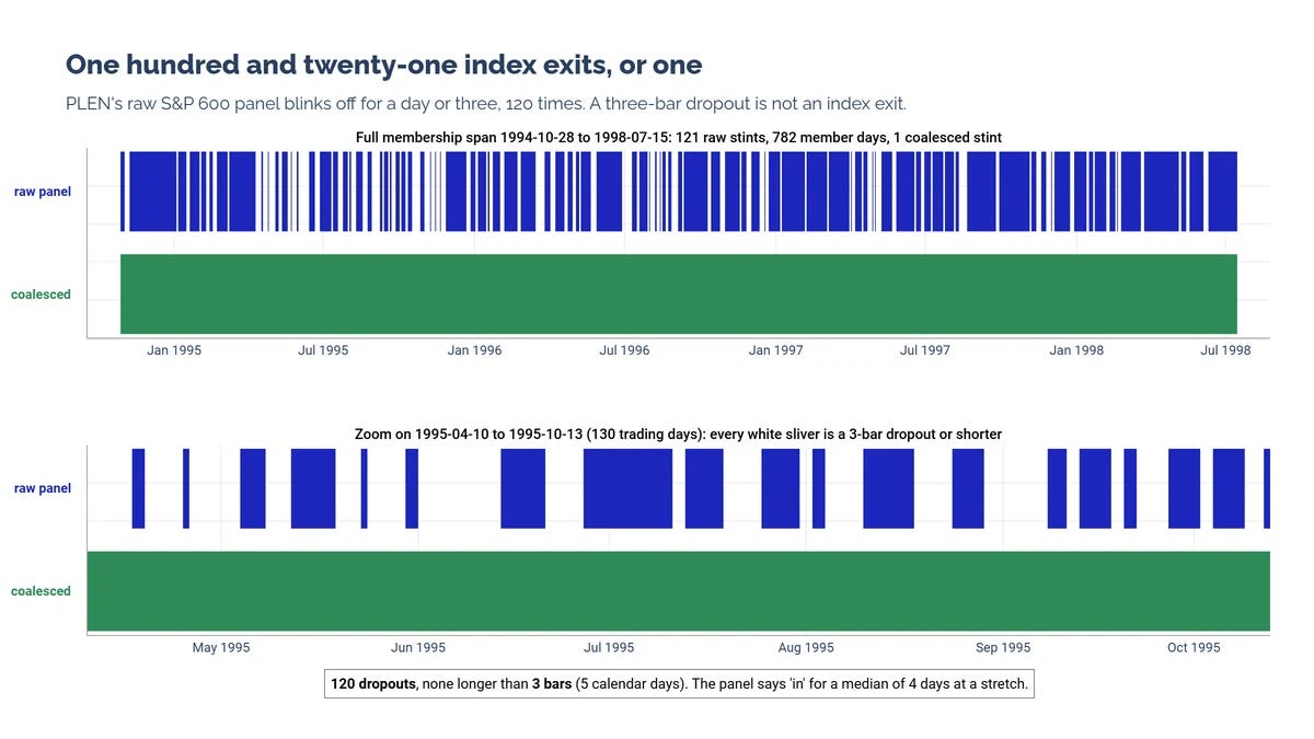
A three-bar dropout is not an index exit in any economic sense, so gaps of five bars or fewer get coalesced into a single stint. That's one of the aforementioned judgment calls, made once and applied everywhere. It's also stable. Thresholds of 21 or 63 bars produce identical results, so nothing hinges on the “5 bar” measurement.
This type of judgement call is extremely important. Where did the earlier plague of 0s come from? From here:
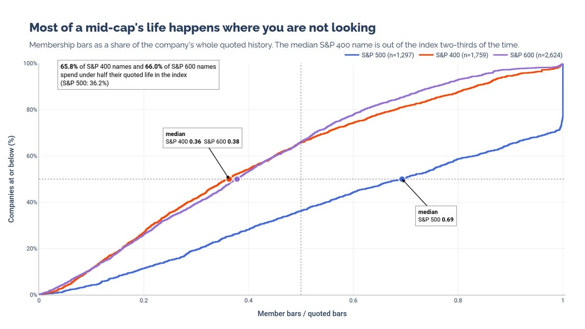
An honest backtest has to know these things.
The median longest stint in the S&P 400 runs 5.9 years. Roughly a quarter of ever-members never complete three years. True rejoins, the Cleveland-Cliffs kind, affect 7.2% of S&P 400 members, and real rejoin gaps run five to eight years while flicker gaps run one to three bars, so the two are not remotely the same phenomenon.
Borders, careers, and revolving doors. That is what "in the index" means, and it's what the walk-forward engine had to learn.
Teaching walk-forward about borders
Walk-forward analysis assumes a stock is a continuous ribbon of history. Tile the ribbon into in-sample and out-of-sample windows, march forward, repeat. Membership turns the ribbon into segments, and every segment raises the same questions. Where may evaluation start? What funds the first in-sample window when a stint is young? What happens to a position when the border arrives mid-trade? What do you do with a stock that has four stints?
I went much deeper on all of this than this piece needs. Here, I’ll outline decision highlights, because they matter.
Each qualifying membership stint is its own evaluation domain. OOS windows tile inside the stint, and the domain ends one bar past the last member bar, so a position that’s open at removal realizes its forced exit honestly.
No OOS window may start before its stint does, and no OOS window exceeds 40% of the total split.
Parameter selection may look back before the stint begins, using trailing, quality-screened tradable history. That replicates what a practitioner would actually do the day a stock joins an index.
Every qualifying stint is evaluated, not just the longest. Evaluating only the dominant stint measured as flattering, +23.65 percentage points per year on the affected names, so that design died. Re-entry is never automatic. Each stint starts flat and waits for a fresh signal.
Any benchmark lives under identical windows. Whatever discipline the strategy accepts, its comparison bar accepts too.
No ideal solution exists in this design space. These are the accepted trade-offs, stated plainly so you can disagree with them specifically.
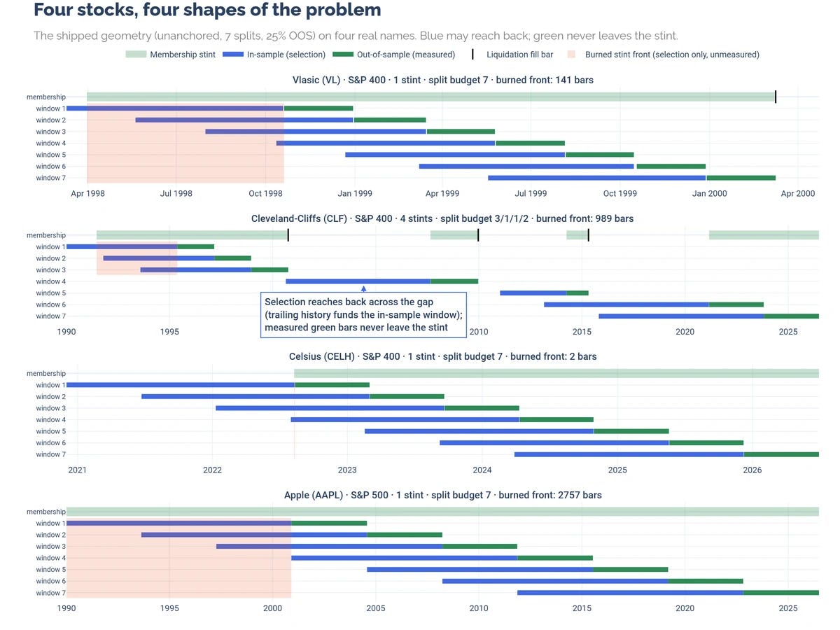
What the new geometry does is easiest to show. Four stocks, four shapes of the problem.
Vlasic has a single stint too young to fund itself, so the front of the stint pays for selection, 141 bars of it.
Cleveland-Cliffs has four S&P 400 stints and gets a split budget of 3, 1, 1, and 2 in a 7-split WFO configuration.
Celsius joins with enough trailing history to fund selection immediately, at a cost of exactly two bars of rounding.
Apple was a member before the panel even starts, so its front is censored and roughly eleven years of history serve selection only.
The blue reaching back across Cleveland-Cliffs' gaps is trailing history funding selection, and it's annotated on the chart precisely so it can't be misread as look-ahead leakage.
What was all this for?
The fix is easiest to judge on the chart that started everything.
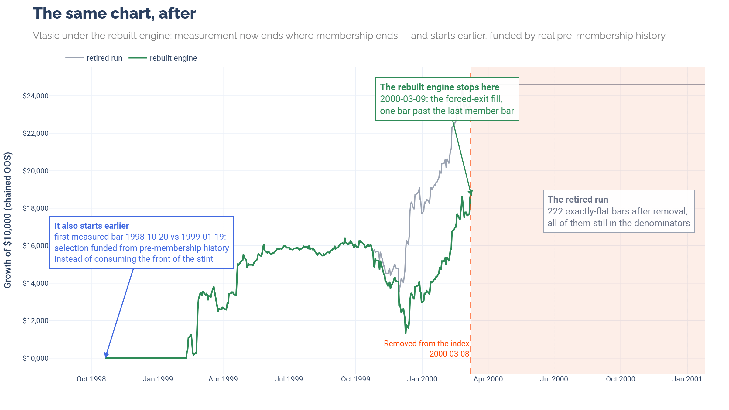
The rebuilt run holds Vlasic for 350 bars and ends where the position ends, on the forced-exit fill one bar past membership. No padding tail. It also starts three months earlier than the retired run, because parameter selection now draws on trailing history instead of burning the front of the stint. The flat line is gone in both directions.
A claim like that deserves a receipt, so the same census ran on both runs.
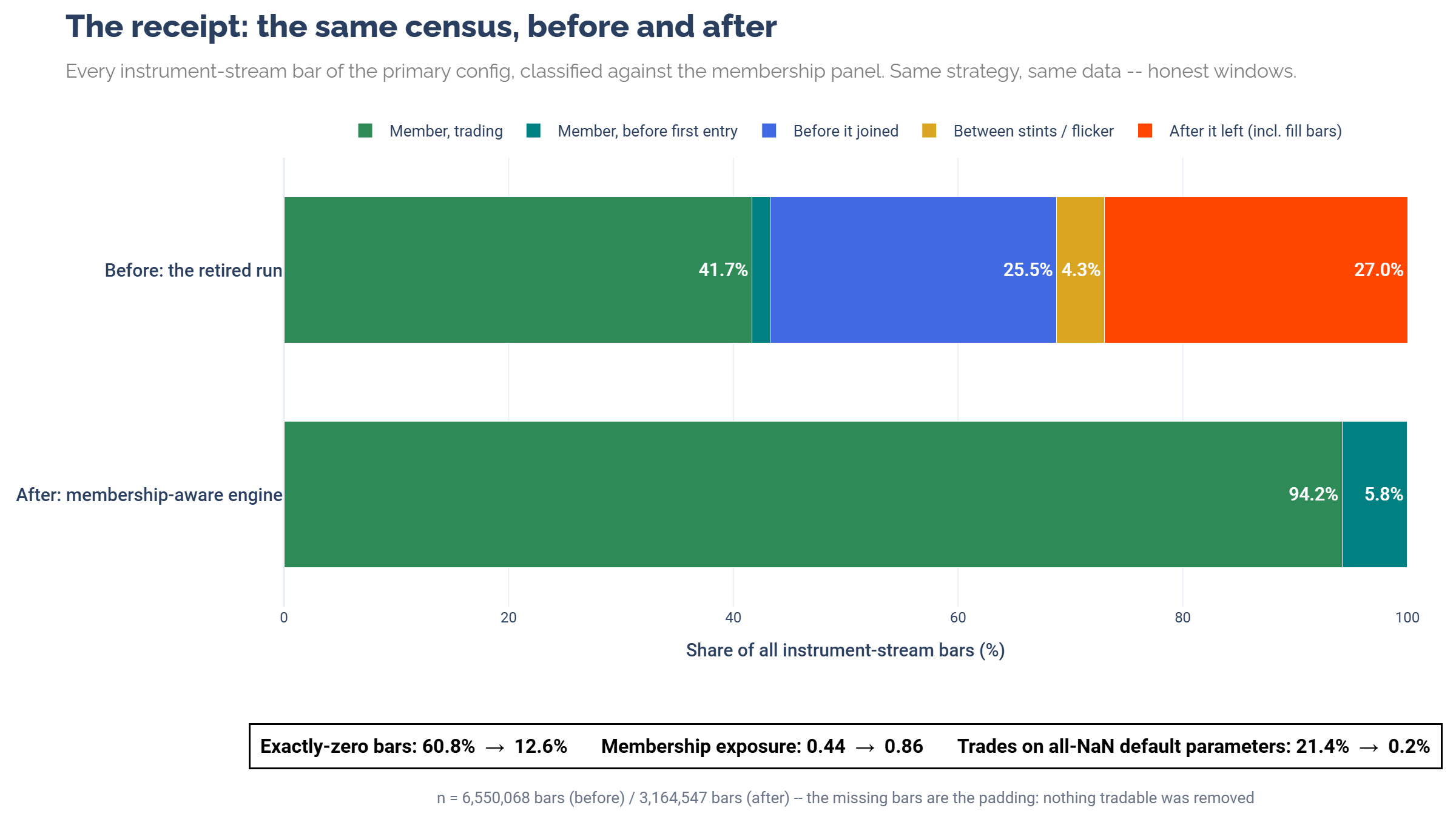
Exactly-zero bars fell from 60.8% to 12.6%. Membership exposure rose from 0.44 to 0.86. The run shrank from 6,550,068 bars to 3,164,547, and every bar that left was a bar that should never have been measured in the first place.
The thing about that flat line is that everything downstream of it was working perfectly. The math was right and the gates kept every promise they were given. The pipeline was even fast.
But the measurement was wrong, and only a dress rehearsal and a pair of eyes on a chart could have caught it. That is the whole argument for how this publication operates. Run the tests. Look at everything. Publish the screens and the costs alongside the results.
Data work is breaking rocks. It’s two hands in the mud, a dirty job of the 21st century. But it has to be done.
What launches next is the rebuilt, membership-aware R2T v2, and the first official results will ride on it.
A thousand ships have been launched.
Until next time, keep on the cutting edge, everyone.
Disclaimers
The content on this page is for educational and informational purposes only. Any views and opinions expressed belong only to the writer and do not represent views and opinions of people, institutions, or organizations that the writer may or may not be associated with.
No material in this page should be construed as buy/sell recommendations, investment advice, determinations of suitability, or solicitations. Securities investment and trading involve risks, and not all risks are disclosed or discussed here. Loss of principal is possible. You are encouraged to seek financial advice from a licensed professional prior to making transaction decisions.
Further, you should not assume that the future performance of any specific investment or investment strategy will be profitable or equal to corresponding past performance levels. Past performance does not guarantee future results.
Technology Note
This article was written with LLM assistance. My typical writing workflow starts with voice transcription via a service like Super Whisper or WisprFlow. Next steps involve grammar checks and line edits with assistance from services like Claude.ai or Grammarly. For sections that are difficult to word correctly, I will ask an LLM for a draft. I always re-write it because LLM prose is almost always mediocre and boring.